corporate collateral
THE BRIEF
Camden is a national, multifamily, luxury apartment company listed on the NYSE and has been awarded Fortune Magazine’s “100 Best Companies to Work For” for 13 straight years. Great emphasis is placed on attracting and retaining talented employees. The annual employee benefits brochure is a key element in that effort.
THE CHALLENGE
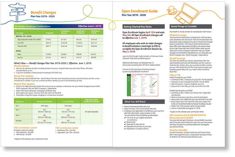
The benefits brochure needed to be written and designed to provide high level information in a way that would attract, inform and retain employees. Complicated information had to be easily understood and visually appealing to the multi-generational, bilingual employee demographic.
GOAL/PROCESS
The design goal was to create a brochure and training guide that made viewing easy and engaging, delineated sections clearly, and used color creatively, while staying within the corporate palette.
UNIQUE SOLUTION
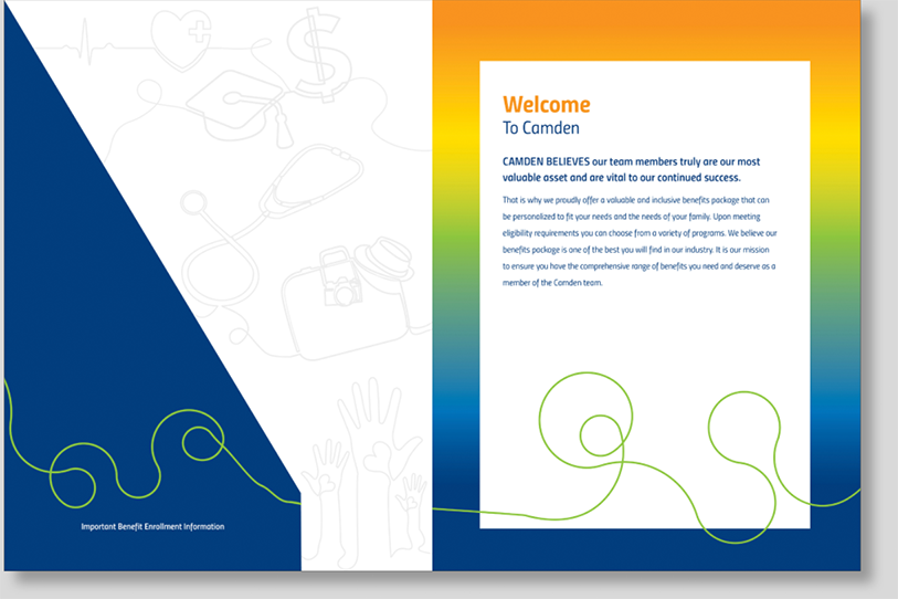
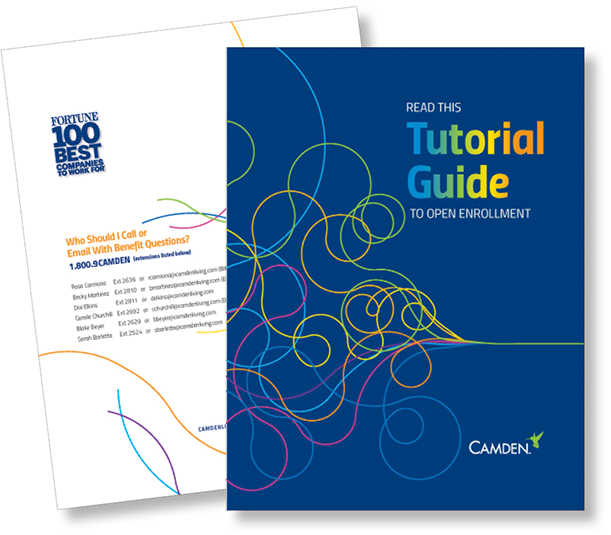
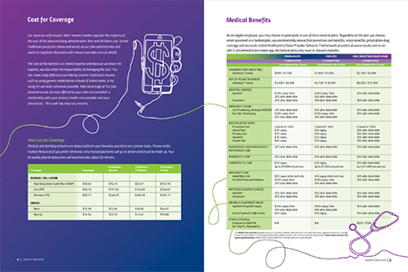
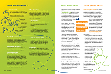
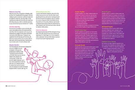
The chosen concept expanded the brochure from 20 to 28 pages with plenty of “white space” so that the key information would not be overcrowded. The various lines on the cover represent the variety of information which all funnels into one continuous line with lineart representing the
key sections throughout the entire brochure. Many charts were designed to communicate the technical information more effectively. Overall, its clean, modern, colorful look appeals to Camden employee demographic and the layout is easy to follow.

I have worked with Kim Hajas for the past 15 years. She is my go-to designer for all things creative. She possesses a great aptitude to convey our brand in every design. She is authentic and honest to the core. Her work is impeccable, and her turnaround time is always faster than I would have hoped. Kim is incredibly skilled in all things print, and I trust her to oversee all press checks, production, and shipping of any print needs.
Julie Keel
Vice President of Marketing

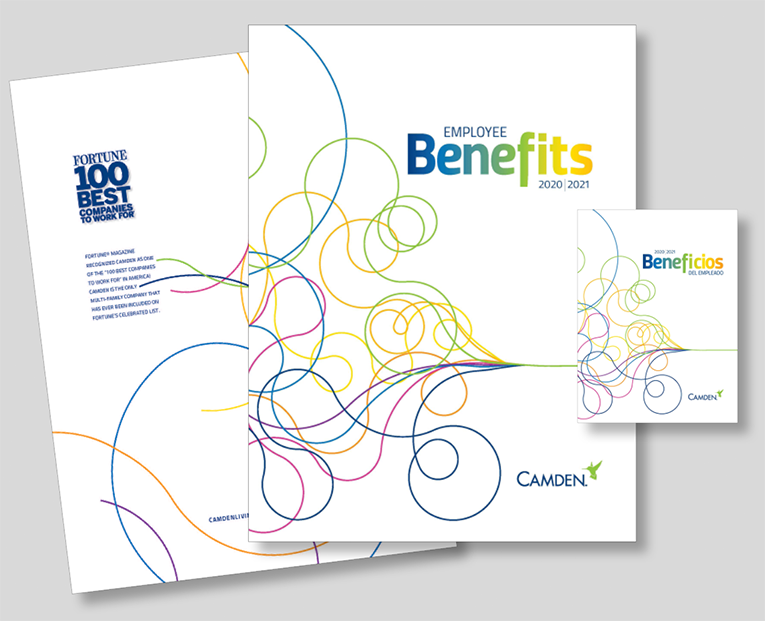
28-Page 9×12 Brochure with custom pocket cover and continuous line art throughout
(English & Spanish)
